Custom Elements
How to create custom elements.
New elements can be registered in builder.config.js under element.types:
// builder.config.js

export default {
  element: {
    types: {
      logo: {
        label: 'Logo',
        description: 'Company logo',
        icon: 'https://domain.com/logo-element-icon.svg',
        category: 'static',
        rules: [],
        schema: {
          type: 'static',
          content: '<img src="https://domain.com/logo.svg" />'
        },
        sections: 'static',
        separators: 'static',
      },
      // ...
    }
  }
}| Name | Type | Description |
|---|---|---|
label* | string | The label of the element in the element list. |
description* | string | The description of the element in the element list. |
icon | string | The url of the element's icon in the element list (if left empty a default icon will be displayed). It's recommended to use SVG to keep the UI high quality on each display. |
category | string | Under which category should the element appear in the element list (if using categories). |
rules* | array | The list of validation rules the element config panel should have if it has validation. |
schema* | object | The schema of the element that will be added. |
sections* | string|object | This determines what configuration options the element has when selected. It can be a string with the name of an other element which's sections should be reused (eg 'text') or an object containing custom configuration options (more about it later). |
separators* | string|object | Defines the separators between of configuration options (more about it later). |
* - mandatory
Reusing Existing Element Types
We can add elements that are based on existing elements but using a different schema. Eg. we have the Select element and we want to make it available with different default configuration.
// The existing "Select" element's schema (default config)

schema: {
  type: 'select',
  label: 'Select',
  search: true,
  native: false,
  inputType: 'search',
  autocomplete: 'off',
  items: [
    { value: 0, label: 'Label' },
  ],
}// Our version of "Select" element's schema
// (implementing a "User selector")
schema: {
type: 'select',
label: 'Users',
native: false,
search: true,
resolveOnLoad: false,
minChars: 2,
delay: 300,
inputType: 'search',
autocomplete: 'off',
items: '/api/users',
}We can add this as a new element type the following way:
// builder.config.js

export default {
  element: {
    types: {
      user: { // <- the unique id of the element
        label: 'User selector',
        description: 'Select a user from the database',
        icon: 'https://domain.com/user-element-icon.svg',
        category: 'fields',
        schema: { // <- default configation options
          type: 'select',
          label: 'Users',
          native: false,
          search: true,
          resolveOnLoad: false,
          minChars: 2,
          delay: 300,
          inputType: 'search',
          autocomplete: 'off',
          items: '/api/users',
        },
        sections: 'select', // <- using the configuration options of 'select'
        separators: 'select', // <- using the configuration options of 'select'
      },
    }
  }
}
The new User selector element will be added to end of Fields element list and will inhert select element's config (sections & separators - more about it later).
Display Order
If we want to change the display order of elements we can use the following unversal list in builder.config.js:
// builder.config.js

export default {
  element: {
    types: {
      user: {
        // ...
      }
    }
  },

  elements: [
    'text',
    'number',
    'email',
    'phone',
    'password',
    'url',
    'user', // <-- "User selector" added here so it will be displayed after "URL"
    'location',
    'textarea',
    'editor',
    'checkbox',
    'checkboxgroup',
    'checkboxBlocks',
    'checkboxTabs',
    'radio',
    'radiogroup',
    'radioBlocks',
    'radioTabs',
    'toggle',
    'select',
    'multiselect',
    'tags',
    'date',
    'datetime',
    'time',
    'dates',
    'dateRange',
    'slider',
    'rangeSlider',
    'verticalSlider',
    'file',
    'multifile',
    'image',
    'multiImage',
    'gallery',
    'hidden',
    'submit',
    'reset',
    'primaryButton',
    'secondaryButton',
    'dangerButton',
    'h1',
    'h2',
    'h3',
    'h4',
    'p',
    'quote',
    'img',
    'link',
    'divider',
    'html',
    'container',
    'container2',
    'container3',
    'container4',
    'list',
    'nestedList',
  ]
}
Disabling Element Features
Element features such as editing or removing can be disabled by adding a builder object to the element schema:
// builder.config.js

export default {
  element: {
    types: {
      user: {
        // ...
        schema: {
          type: 'select',
          label: 'Users',
          // ...
          builder: {
            remove: false,  // Disables removing the element
            clone: false,   // Disables cloning the element
            move: false,    // Disables moving the element
            edit: false,    // Disabled editing the element
            resize: false,  // Disables resizing the element
          }
        },
      },
    }
  }
}
Containers and lists containing an element with disabled features will also have their features disabled. This is true for each from above except edit.
Available Element Types
Here's the list of available element types that can be used:
| Key | Configuration panel example |
|---|---|
button | Submit button |
checkbox | Checkbox |
checkboxgroup | Checkbox group |
date | Date |
dates | Multiple dates |
editor | WYSIWYG editor |
file | File upload |
hidden | Hidden input |
location | Location |
multifile | Multi-file upload |
multiselect | Multiselect |
container | Container |
radio | Radio |
radiogroup | Radio group |
select | Select |
slider | Slider |
html | Static HTML |
tags | Tags |
text | Text input |
textarea | Textarea |
toggle | Toggle |
They can be used in the sections and separators property of a new element type, as seen above, eg:
// builder.config.js

export default {
  element: {
    types: {
      user: {
        label: 'User selector',
        description: 'Select a user from the database',
        icon: 'https://domain.com/user-element-icon.svg',
        category: 'fields',
        schema: {
          // ...
        },
        sections: 'select', // <- element type
        separators: 'select', // <- element type
      },
      // ...
    }
  }
}
Creating New Elements with Custom Configuration Panel
If we want to add a custom element, first we have to register it for Vueform based on the docs in Vueform's Creating Elements section.
Let's say we registered a new element called LogoElement. Now, we're able to add it to the builder:
// builder.config.js

export default {
  element: {
    types: {
      logo: {
        label: 'Logo',
        description: 'Company logo',
        icon: 'https://domain.com/logo-element-icon.svg',
        category: 'static',
        rules: [],
        schema: {
          type: 'logo', // <- using our new `LogoElement` type
        },
        sections: {
          // ...
        },
        separators: {
          // ...
        },
      }
    }
  }
}
The options are the same as discussed at the top of this section. The only difference is that this time we're going to use an object as the value for sections and separators. This is where we'll define what configuration options the element should have on the right panel when selected.
Defining Sections
Each element has the following sections (it's recommended to follow this convention):
export default {
element: {
types: {
custom: {
// ...
sections: {
/**
* General properties like name, label, placeholder, description,
*/
properties: {
// ...
},
/**
* Element specific properties like search options for select or
* date constraints for date element, etc. Put here everything
* that is unique to the element (other probably don't have).
*/
options: {
// ...
},
/**
* Everything that is related to the element's data. Eg. default
* value, available options/items, etc. If the element is static
* eg. a button you can leave out this part.
*/
data: {
// ...
},
/**
* Configuration of decorators of the element, eg. prefix/suffix,
* before/between/after contents.
*/
decorators: {
// ...
},
/**
* Everything that is related to the look of the element, eg.
* sizing, columns width, view options, etc.
*/
layout: {
// ...
},
/**
* Configuration options related to validation rules, eg. field
* name & validation rules. If the element is static
* eg. a button you can leave out this part.
*/
validation: {
// ...
},
/**
* It should contain everything related to rendering the element
* conditionally.
*/
conditions: {
// ...
},
/**
* If the element has native attributes (like `disbled` or
* `readonly`) for `<input>` they can be put here.
*/
attributes: {
// ...
},
},
},
},
},
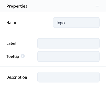
}Sections must define a name, label and fields like:
properties: {
  name: 'properties',
  label: 'Properties',
  fields: {
    // ...
  }
}
The fields contain configuration fields that are either provided by Vueform Builder or custom created.
Using Fields Provided by Vueform
Our LogoElement is static so we don't need data and validation sections and to keep things simple we'll also exclude attributes section. We're left with following sections:
propertiesoptionsdecoratorslayoutconditions
Now we need to fill in the sections with actual configuration fields. Existing fields can be imported from @vueform/builder:
import {
  TypeField,
  NameField,
  LabelField,
  InfoField,
  DescriptionField,
  BeforeField,
  BetweenField,
  AfterField,
  SizeField,
  ColumnsField,
  ConditionsField,
} from '@vueform/builder'

export default {
  element: {
    types: {
      logo: {
        label: 'Logo',
        description: 'Company logo',
        icon: 'https://domain.com/logo-element-icon.svg',
        category: 'static',
        schema: {
          type: 'logo',
        },
        sections: {
          properties: {
            name: 'properties',
            label: 'Properties',
            fields: {
              type: { type: TypeField, },
              name: { type: NameField, },
              label: { type: LabelField, },
              tooltip: { type: InfoField, },
              description: { type: DescriptionField, },
            },
          },
          options: {
            name: 'options',
            label: 'Logo options',
            fields: {
              // ... custom fields will come here
            },
          },
          decorators: {
            name: 'decorators',
            label: 'Decorators',
            fields: {
              before: { type: BeforeField, },
              between: { type: BetweenField, },
              after: { type: AfterField, },
            },
          },
          layout: {
            name: 'layout',
            label: 'Layout',
            fields: {
              size: { type: SizeField, },
              columns: { type: ColumnsField, },
            },
          },
          conditions: {
            name: 'conditions',
            label: 'Conditions',
            fields: {
              conditions: { type: ConditionsField, },
            },
          },
        },
        separators: {
          // ...
        },
      },
    },
  },
},
Every field must only be used under the section name it's supposed to be at. Eg.
ConditionsFieldmust be inconditionssection,ColumnsFieldinlayout, etc. You can find the full list of fields and their location at the end of this chapter.
Each new element must have at least a TypeField in properties everything else is in fact optional.
Note: custom element fields can later also be disabled in builder.config.js as seen previously:
// builder.config.js

export default {
  element: {
    props: {
      logo: {
        properties: {
          label: false,
          info: false,
          description: false,
        },
        decorators: false,
      }
    }
  }
}
We can even disable our custom fields once we add them.
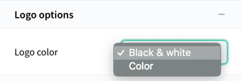
Creating Custom Fields
We can create our own configuration field eg. a color selector for our LogoElement that can choose between "Black & white" and "Color" versions.
To do this let's create a LogoColorField.js somewhere in our project:
// LogoColorField.js

import { BaseElementField } from '@vueform/builder'

export default class LogoColorField extends BaseElementField
{
  get schema() {
    return {
      color: {
        type: 'select',
        label: 'Logo color',
        columns: { label: 6 },
        items: {
          'bw': 'Black & white',
          'color': 'Color',
        },
      }
    }
  }
}
This field is going to set the color property of our LogoElement component, so the LogoElement component should have a color property which defines which logo is rendered.
Fields can use Vueform's schema object to define configuration options.
The
defaultoption behaves differently than in a regular schema. It will not load the default value of the config option when the panel is opened. It will be interpreted as a value which should remove the config option from the element's schema. For example if our logo element's color property isbwby default it will bebwwithout explicitly defining any color. This means that thecoloroption field (the one we define above) should havedefault: 'bw'option which results in thecoloroption being removed from the element's schema whenbwis selected so we don't explicitly define an option unnecessarily.
Next add our custom field to our element definition:
import {
  TypeField,
  NameField,
  LabelField,
  InfoField,
  DescriptionField,
  BeforeField,
  BetweenField,
  AfterField,
  SizeField,
  ColumnsField,
  ConditionsField,
} from '@vueform/builder'

import LogoColorField from './path/to/LogoColorField.js'

export default {
  element: {
    types: {
      logo: {
        label: 'Logo',
        description: 'Company logo',
        icon: 'https://domain.com/logo-element-icon.svg',
        category: 'static',
        schema: {
          type: 'logo',
        },
        sections: {
          properties: {
            name: 'properties',
            label: 'Properties',
            fields: {
              type: { type: TypeField, },
              name: { type: NameField, },
              label: { type: LabelField, },
              tooltip: { type: InfoField, },
              description: { type: DescriptionField, },
            },
          },
          options: {
            name: 'options',
            label: 'Logo options',
            fields: {
              color: { type: LogoColorField, }, // <- added here
            },
          },
          decorators: {
            name: 'decorators',
            label: 'Decorators',
            fields: {
              before: { type: BeforeField, },
              between: { type: BetweenField, },
              after: { type: AfterField, },
            },
          },
          layout: {
            name: 'layout',
            label: 'Layout',
            fields: {
              size: { type: SizeField, },
              columns: { type: ColumnsField, },
            },
          },
          conditions: {
            name: 'conditions',
            label: 'Conditions',
            fields: {
              conditions: { type: ConditionsField, },
            },
          },
        },
        separators: {
          // ...
        },
      },
    },
  },
},
Now if we drag the "Logo" element to our form and click on it, we'll see our custom config field showing up between other configuration options:
Adding Separators
Separators can add dividers between configuration options. Eg. this would add a divider between Name & Label and Info & Descrpition:
separators: {
  properties: [
    ['type', 'name'],
    ['label', 'tooltip'],
    ['description'],
  ],
},
Fields should be groupped in an array that belong together so that dividers can be rendered between groups. This way of defining separators is required because config options can be turned on and off so it should know how to group certain options.
Add a separator between SizeField and ColumnsField and move everything to the element definition. Here's the final result:
import {
  TypeField,
  NameField,
  LabelField,
  InfoField,
  DescriptionField,
  BeforeField,
  BetweenField,
  AfterField,
  SizeField,
  ColumnsField,
  ConditionsField,
} from '@vueform/builder'

import LogoColorField from './path/to/LogoColorField.js'

export default {
  element: {
    types: {
      logo: {
        label: 'Logo',
        description: 'Company logo',
        icon: 'https://domain.com/logo-element-icon.svg',
        category: 'static',
        rules: [],
        schema: {
          type: 'logo',
        },
        sections: {
          properties: {
            name: 'properties',
            label: 'Properties',
            fields: {
              type: { type: TypeField, },
              name: { type: NameField, },
              label: { type: LabelField, },
              tooltip: { type: InfoField, },
              description: { type: DescriptionField, },
            },
          },
          options: {
            name: 'options',
            label: 'Logo options',
            fields: {
              color: { type: LogoColorField, },
            },
          },
          decorators: {
            name: 'decorators',
            label: 'Decorators',
            fields: {
              before: { type: BeforeField, },
              between: { type: BetweenField, },
              after: { type: AfterField, },
            },
          },
          layout: {
            name: 'layout',
            label: 'Layout',
            fields: {
              size: { type: SizeField, },
              columns: { type: ColumnsField, },
            },
          },
          conditions: {
            name: 'conditions',
            label: 'Conditions',
            fields: {
              conditions: { type: ConditionsField, },
            },
          },
        },
        separators: {
          properties: [
            ['type', 'name'],
            ['label', 'tooltip'],
            ['description'],
          ],
          layout: [
            ['size'],
            ['columns'],
          ]
        },
      },
    },
  },
},
Existing Element Configurations
Here's the full list of existing element configurations.
button
Used by:
- Submit button
- Reset button
- Primary button
- Secondary button
- Danger button
import {
  TypeField,
  NameField,
  LabelField,
  InfoField,
  DescriptionField,
  ButtonLabelField,
  ButtonTypeField,
  SubmitsField,
  ResetsField,
  HrefField,
  TargetField,
  BeforeField,
  BetweenField,
  AfterField,
  SizeField,
  ColumnsField,
  ConditionsField,
  DisabledField,
  IdField,
} from '@vueform/builder'

export default {
  sections: {
    properties: {
      name: 'properties',
      label: 'Properties',
      fields: {
        type: { type: TypeField },
        name: { type: NameField },
        label: { type: LabelField },
        tooltip: { type: InfoField },
        description: { type: DescriptionField },
      },
    },
    options: {
      name: 'options',
      label: 'Options',
      fields: {
        buttonLabel: { type: ButtonLabelField },
        buttonType: { type: ButtonTypeField },
        submits: { type: SubmitsField },
        resets: { type: ResetsField },
        href: { type: HrefField },
        target: { type: TargetField },
      },
    },
    decorators: {
      name: 'decorators',
      label: 'Decorators',
      fields: {
        before: { type: BeforeField },
        between: { type: BetweenField },
        after: { type: AfterField },
      },
    },
    layout: {
      name: 'layout',
      label: 'Layout',
      fields: {
        size: { type: SizeField },
        columns: { type: ColumnsField },
      },
    },
    conditions: {
      name: 'conditions',
      label: 'Conditions',
      fields: {
        conditions: { type: ConditionsField },
      },
    },
    attributes: {
      name: 'attributes',
      label: 'Attributes',
      fields: {
        disabled: { type: DisabledField },
        id: { type: IdField },
      },
    },
  },
  separators: {
    properties: [
      ['type', 'name'],
      ['label', 'tooltip'],
      ['description'],
    ],
    options: [
      ['buttonLabel'],
      ['buttonType'],
      ['submits', 'resets'],
      ['!', 'href', 'target'],
    ],
    layout: [
      ['size'],
      ['columns'],
    ],
    attributes: [
      ['disabled', 'id'],
    ],
  }
}
checkbox
Used by:
- Checkbox
import {
  TypeField,
  NameField,
  LabelField,
  InfoField,
  DescriptionField,
  TextField,
  BoolValueField,
  DefaultField_checkbox,
  SubmitField,
  BeforeField,
  BetweenField,
  AfterField,
  SizeField,
  ColumnsField,
  FieldNameField,
  ValidationField,
  ConditionsField,
  DisabledField,
  IdField,
} from '@vueform/builder'

export default {
  sections: {
    properties: {
      name: 'properties',
      label: 'Properties',
      fields: {
        type: { type: TypeField },
        name: { type: NameField },
        label: { type: LabelField },
        tooltip: { type: InfoField },
        description: { type: DescriptionField },
      },
    },
    options: {
      name: 'options',
      label: 'Options',
      fields: {
        text: { type: TextField },
        boolValue: { type: BoolValueField },
      },
    },
    data: {
      name: 'data',
      label: 'Data',
      fields: {
        default: { type: DefaultField_checkbox },
        submit: { type: SubmitField },
      },
    },
    decorators: {
      name: 'decorators',
      label: 'Decorators',
      fields: {
        before: { type: BeforeField },
        between: { type: BetweenField },
        after: { type: AfterField },
      },
    },
    layout: {
      name: 'layout',
      label: 'Layout',
      fields: {
        size: { type: SizeField },
        columns: { type: ColumnsField },
      },
    },
    validation: {
      name: 'validation',
      label: 'Validation',
      fields: {
        fieldName: { type: FieldNameField },
        validation: { type: ValidationField },
      },
    },
    conditions: {
      name: 'conditions',
      label: 'Conditions',
      fields: {
        conditions: { type: ConditionsField },
      },
    },
    attributes: {
      name: 'attributes',
      label: 'Attributes',
      fields: {
        disabled: { type: DisabledField },
        id: { type: IdField },
      },
    },
  },
  separators: {
    properties: [
      ['type', 'name'],
      ['label', 'tooltip'],
      ['description'],
    ],
    options: [
      ['text'],
      ['boolValue'],
    ],
    layout: [
      ['size'],
      ['columns'],
    ],
    validation: [
      ['fieldName'],
      ['validation'],
    ],
    attributes: [
      ['disabled', 'id'],
    ],
  }
}
checkboxgroup
Used by:
- Checkbox group
- Checkbox blocks
- Checkbox tabs
import {
  TypeField,
  NameField,
  LabelField,
  InfoField,
  DescriptionField,
  ItemsField,
  DefaultField_checkboxgroup,
  SubmitField,
  BeforeField,
  BetweenField,
  AfterField,
  ViewField,
  SizeField,
  ColumnsField,
  FieldNameField,
  ValidationField,
  ConditionsField,
  DisabledField,
  IdField,
} from '@vueform/builder'

export default {
  sections: {
    properties: {
      name: 'properties',
      label: 'Properties',
      fields: {
        type: { type: TypeField },
        name: { type: NameField },
        label: { type: LabelField },
        tooltip: { type: InfoField },
        description: { type: DescriptionField },
      },
    },
    data: {
      name: 'data',
      label: 'Data',
      fields: {
        items: { type: ItemsField },
        default: { type: DefaultField_checkboxgroup },
        submit: { type: SubmitField },
      },
    },
    decorators: {
      name: 'decorators',
      label: 'Decorators',
      fields: {
        before: { type: BeforeField },
        between: { type: BetweenField },
        after: { type: AfterField },
      },
    },
    layout: {
      name: 'layout',
      label: 'Layout',
      fields: {
        view: { type: ViewField },
        size: { type: SizeField },
        columns: { type: ColumnsField },
      },
    },
    validation: {
      name: 'validation',
      label: 'Validation',
      fields: {
        fieldName: { type: FieldNameField },
        validation: { type: ValidationField },
      },
    },
    conditions: {
      name: 'conditions',
      label: 'Conditions',
      fields: {
        conditions: { type: ConditionsField },
      },
    },
    attributes: {
      name: 'attributes',
      label: 'Attributes',
      fields: {
        disabled: { type: DisabledField },
        id: { type: IdField },
      },
    },
  },
  separators: {
    properties: [
      ['type', 'name'],
      ['label', 'tooltip'],
      ['description'],
    ],
    data: [
      ['items'],
      ['default', 'submit'],
    ],
    layout: [
      ['view'],
      ['size'],
      ['columns'],
    ],
    validation: [
      ['fieldName'],
      ['validation'],
    ],
    attributes: [
      ['disabled', 'id'],
    ],
  }
}
date
Used by:
- Date
import {
  TypeField,
  NameField,
  LabelField,
  InfoField,
  PlaceholderField,
  DescriptionField,
  DateFormatField,
  DateRestrictionsField,
  DefaultField_date,
  SubmitField,
  AddonsField,
  BeforeField,
  BetweenField,
  AfterField,
  SizeField,
  ColumnsField,
  FieldNameField,
  ValidationField,
  ConditionsField,
  DisabledField,
  ReadonlyField,
  IdField,
} from '@vueform/builder'

export default {
  sections: {
    properties: {
      name: 'properties',
      label: 'Properties',
      fields: {
        type: { type: TypeField },
        name: { type: NameField },
        label: { type: LabelField },
        tooltip: { type: InfoField },
        placeholder: { type: PlaceholderField },
        description: { type: DescriptionField },
      },
    },
    options: {
      name: 'options',
      label: 'Options',
      fields: {
        format: { type: DateFormatField },
        restrictions: { type: DateRestrictionsField },
      },
    },
    data: {
      name: 'data',
      label: 'Data',
      fields: {
        default: { type: DefaultField_date },
        submit: { type: SubmitField },
      },
    },
    decorators: {
      name: 'decorators',
      label: 'Decorators',
      fields: {
        addons: { type: AddonsField },
        before: { type: BeforeField },
        between: { type: BetweenField },
        after: { type: AfterField },
      },
    },
    layout: {
      name: 'layout',
      label: 'Layout',
      fields: {
        size: { type: SizeField },
        columns: { type: ColumnsField },
      },
    },
    validation: {
      name: 'validation',
      label: 'Validation',
      fields: {
        fieldName: { type: FieldNameField },
        validation: { type: ValidationField },
      },
    },
    conditions: {
      name: 'conditions',
      label: 'Conditions',
      fields: {
        conditions: { type: ConditionsField },
      },
    },
    attributes: {
      name: 'attributes',
      label: 'Attributes',
      fields: {
        disabled: { type: DisabledField },
        readonly: { type: ReadonlyField },
        id: { type: IdField },
      },
    },
  },
  separators: {
    properties: [
      ['name'],
      ['label', 'tooltip'],
      ['placeholder'],
      ['description'],
    ],
    options: [
      ['format'],
      ['restrictions'],
    ],
    data: [
      ['default', 'submit'],
    ],
    decorators: [
      ['addons'],
      ['before', 'between', 'after'],
    ],
    layout: [
      ['size'],
      ['columns'],
    ],
    validation: [
      ['fieldName'],
      ['validation'],
    ],
    attributes: [
      ['disabled', 'readonly', 'id'],
    ],
  }
}
dates
Used by:
- Multiple dates
- Date range
import {
  TypeField,
  NameField,
  LabelField,
  InfoField,
  PlaceholderField,
  DescriptionField,
  DateModeField,
  DateFormatField,
  DateRestrictionsField,
  DefaultField_dates,
  SubmitField,
  AddonsField,
  BeforeField,
  BetweenField,
  AfterField,
  SizeField,
  ColumnsField,
  FieldNameField,
  ValidationField,
  ConditionsField,
  DisabledField,
  ReadonlyField,
  IdField,
} from '@vueform/builder'

export default {
  sections: {
    properties: {
      name: 'properties',
      label: 'Properties',
      fields: {
        type: { type: TypeField },
        name: { type: NameField },
        label: { type: LabelField },
        tooltip: { type: InfoField },
        placeholder: { type: PlaceholderField },
        description: { type: DescriptionField },
      },
    },
    options: {
      name: 'options',
      label: 'Options',
      fields: {
        mode: { type: DateModeField },
        format: { type: DateFormatField },
        restrictions: { type: DateRestrictionsField },
      },
    },
    data: {
      name: 'data',
      label: 'Data',
      fields: {
        default: { type: DefaultField_dates },
        submit: { type: SubmitField },
      },
    },
    decorators: {
      name: 'decorators',
      label: 'Decorators',
      fields: {
        addons: { type: AddonsField },
        before: { type: BeforeField },
        between: { type: BetweenField },
        after: { type: AfterField },
      },
    },
    layout: {
      name: 'layout',
      label: 'Layout',
      fields: {
        size: { type: SizeField },
        columns: { type: ColumnsField },
      },
    },
    validation: {
      name: 'validation',
      label: 'Validation',
      fields: {
        fieldName: { type: FieldNameField },
        validation: { type: ValidationField },
      },
    },
    conditions: {
      name: 'conditions',
      label: 'Conditions',
      fields: {
        conditions: { type: ConditionsField },
      },
    },
    attributes: {
      name: 'attributes',
      label: 'Attributes',
      fields: {
        disabled: { type: DisabledField },
        readonly: { type: ReadonlyField },
        id: { type: IdField },
      },
    },
  },
  separators: {
    properties: [
      ['name'],
      ['label', 'tooltip'],
      ['placeholder'],
      ['description'],
    ],
    options: [
      ['mode'],
      ['format'],
      ['restrictions'],
    ],
    data: [
      ['default', 'submit'],
    ],
    layout: [
      ['size'],
      ['columns'],
    ],
    validation: [
      ['fieldName'],
      ['validation'],
    ],
    attributes: [
      ['disabled', 'readonly', 'id'],
    ],
  }
}
datetime
Used by:
- Datetime
import {
  Hour24Field,
  SecondsField,
  DateFormatField,
  DateRestrictionsField,
  DefaultField_datetime,
  SubmitField,
} from '@vueform/builder'

export default {
  sections: {
    properties: {
      name: 'properties',
      label: 'Properties',
      fields: {
        type: { type: TypeField },
        name: { type: NameField },
        label: { type: LabelField },
        tooltip: { type: InfoField },
        placeholder: { type: PlaceholderField },
        description: { type: DescriptionField },
      },
    },
    options: {
      name: 'options',
      label: 'Options',
      fields: {
        hour24: { type: Hour24Field },
        seconds: { type: SecondsField },
        format: { type: DateFormatField },
        restrictions: { type: DateRestrictionsField },
      },
    },
    data: {
      name: 'data',
      label: 'Data',
      fields: {
        default: { type: DefaultField_datetime },
        submit: { type: SubmitField },
      },
    },
    decorators: {
      name: 'decorators',
      label: 'Decorators',
      fields: {
        addons: { type: AddonsField },
        before: { type: BeforeField },
        between: { type: BetweenField },
        after: { type: AfterField },
      },
    },
    layout: {
      name: 'layout',
      label: 'Layout',
      fields: {
        size: { type: SizeField },
        columns: { type: ColumnsField },
      },
    },
    validation: {
      name: 'validation',
      label: 'Validation',
      fields: {
        fieldName: { type: FieldNameField },
        validation: { type: ValidationField },
      },
    },
    conditions: {
      name: 'conditions',
      label: 'Conditions',
      fields: {
        conditions: { type: ConditionsField },
      },
    },
    attributes: {
      name: 'attributes',
      label: 'Attributes',
      fields: {
        disabled: { type: DisabledField },
        readonly: { type: ReadonlyField },
        id: { type: IdField },
      },
    },
  },
  separators: {
    properties: [
      ['name'],
      ['label', 'tooltip'],
      ['placeholder'],
      ['description'],
    ],
    options: [
      ['hour24', 'seconds'],
      ['format'],
      ['restrictions'],
    ],
    data: [
      ['default', 'submit'],
    ],
    decorators: [
      ['addons'],
      ['before', 'between', 'after'],
    ],
    layout: [
      ['size'],
      ['columns'],
    ],
    validation: [
      ['fieldName'],
      ['validation'],
    ],
    attributes: [
      ['disabled', 'readonly', 'id'],
    ],
  }
}
editor
Used by:
- WYSIWYG editor
import {
  TypeField,
  NameField,
  LabelField,
  InfoField,
  PlaceholderField,
  DescriptionField,
  EndpointField,
  AcceptField,
  ToolsField,
  DefaultField_editor,
  SubmitField,
  BeforeField,
  BetweenField,
  AfterField,
  SizeField,
  ColumnsField,
  FieldNameField,
  ValidationField,
  ConditionsField,
  DisabledField,
  IdField,
} from '@vueform/builder'

export default {
  sections: {
    properties: {
      name: 'properties',
      label: 'Properties',
      fields: {
        type: { type: TypeField },
        name: { type: NameField },
        label: { type: LabelField },
        tooltip: { type: InfoField },
        placeholder: { type: PlaceholderField },
        description: { type: DescriptionField },
      },
    },
    options: {
      name: 'options',
      label: 'Options',
      fields: {
        endpoint: { type: EndpointField },
        accept: { type: AcceptField },
        tools: { type: ToolsField },
      },
    },
    data: {
      name: 'data',
      label: 'Data',
      fields: {
        default: { type: DefaultField_editor },
        submit: { type: SubmitField },
      },
    },
    decorators: {
      name: 'decorators',
      label: 'Decorators',
      fields: {
        before: { type: BeforeField },
        between: { type: BetweenField },
        after: { type: AfterField },
      },
    },
    layout: {
      name: 'layout',
      label: 'Layout',
      fields: {
        size: { type: SizeField },
        columns: { type: ColumnsField },
      },
    },
    validation: {
      name: 'validation',
      label: 'Validation',
      fields: {
        fieldName: { type: FieldNameField },
        validation: { type: ValidationField },
      },
    },
    conditions: {
      name: 'conditions',
      label: 'Conditions',
      fields: {
        conditions: { type: ConditionsField },
      },
    },
    attributes: {
      name: 'attributes',
      label: 'Attributes',
      fields: {
        disabled: { type: DisabledField },
        id: { type: IdField },
      },
    },
  },
  separators: {
    properties: [
      ['name'],
      ['label', 'tooltip'],
      ['placeholder'],
      ['description'],
    ],
    options: [
      ['endpoint'],
      ['accept'],
      ['!', 'tools'],
    ],
    layout: [
      ['size'],
      ['columns'],
    ],
    validation: [
      ['fieldName'],
      ['validation'],
    ],
    attributes: [
      ['disabled', 'id'],
    ],
  }
}
file
Used by:
- File upload
- Image upload
import {
  TypeField,
  NameField,
  LabelField,
  InfoField,
  DescriptionField,
  AutoUploadField,
  DragAndDropField,
  SoftRemoveField,
  ClickableField,
  FileUrlsField,
  FileAcceptField,
  FileEndpointsField,
  ParamsField,
  DefaultField,
  SubmitField,
  BeforeField,
  BetweenField,
  AfterField,
  ViewField_file,
  SizeField,
  ColumnsField,
  FieldNameField,
  ValidationField,
  ConditionsField,
  DisabledField,
  IdField,
} from '@vueform/builder'

export default {
  sections: {
    properties: {
      name: 'properties',
      label: 'Properties',
      fields: {
        type: { type: TypeField },
        name: { type: NameField },
        label: { type: LabelField },
        tooltip: { type: InfoField },
        description: { type: DescriptionField },
      },
    },
    options: {
      name: 'options',
      label: 'Options',
      fields: {
        autoUpload: { type: AutoUploadField },
        dragAndDrop: { type: DragAndDropField },
        softRemove: { type: SoftRemoveField },
        clickable: { type: ClickableField },
        urls: { type: FileUrlsField },
        accept: { type: FileAcceptField },
        endpoints: { type: FileEndpointsField },
        params: { type: ParamsField },
      },
    },
    data: {
      name: 'data',
      label: 'Data',
      fields: {
        default: { type: DefaultField },
        submit: { type: SubmitField },
      },
    },
    decorators: {
      name: 'decorators',
      label: 'Decorators',
      fields: {
        before: { type: BeforeField },
        between: { type: BetweenField },
        after: { type: AfterField },
      },
    },
    layout: {
      name: 'layout',
      label: 'Layout',
      fields: {
        view: { type: ViewField_file },
        size: { type: SizeField },
        columns: { type: ColumnsField },
      },
    },
    validation: {
      name: 'validation',
      label: 'Validation',
      fields: {
        fieldName: { type: FieldNameField },
        validation: { type: ValidationField },
      },
    },
    conditions: {
      name: 'conditions',
      label: 'Conditions',
      fields: {
        conditions: { type: ConditionsField },
      },
    },
    attributes: {
      name: 'attributes',
      label: 'Attributes',
      fields: {
        disabled: { type: DisabledField },
        id: { type: IdField },
      },
    },
  },
  separators: {
    properties: [
      ['type', 'name'],
      ['label', 'tooltip'],
      ['description'],
    ],
    options: [
      ['autoUpload', 'dragAndDrop', 'softRemove', 'clickable'],
      ['!', 'urls'],
      ['!', 'accept'],
      ['endpoints'],
      ['!', 'params'],
    ],
    data: [
      ['default', 'submit'],
    ],
    layout: [
      ['view'],
      ['size'],
      ['columns'],
    ],
    validation: [
      ['fieldName'],
      ['validation'],
    ],
    attributes: [
      ['disabled', 'id'],
    ],
  }
}
hidden
Used by:
- Hidden input
import {
  TypeField,
  NameField,
  MetaField,
  DefaultField_multilingual,
  SubmitField,
  ConditionsField,
  IdField,
  AttrsField,
} from '@vueform/builder'

export default {
  sections: {
    properties: {
      name: 'properties',
      label: 'Properties',
      fields: {
        type: { type: TypeField },
        name: { type: NameField },
        meta: { type: MetaField },
      },
    },
    data: {
      name: 'data',
      label: 'Data',
      fields: {
        default: { type: DefaultField_multilingual },
        submit: { type: SubmitField },
      },
    },
    conditions: {
      name: 'conditions',
      label: 'Conditions',
      fields: {
        conditions: { type: ConditionsField },
      },
    },
    attributes: {
      name: 'attributes',
      label: 'Attributes',
      fields: {
        id: { type: IdField },
        attrs: { type: AttrsField },
      },
    },
  },
  separators: {
  }
}
location
Used by:
- Location
import {
  TypeField,
  NameField,
  InputTypeField,
  LabelField,
  InfoField,
  PlaceholderField,
  DescriptionField,
  DefaultField_location,
  SubmitField,
  AddonsField,
  BeforeField,
  BetweenField,
  AfterField,
  SizeField,
  ColumnsField,
  FieldNameField,
  ValidationField,
  ConditionsField,
  DisabledField,
  ReadonlyField,
  IdField,
  AutocompleteField,
  AttrsField,
} from '@vueform/builder'

export default {
  sections: {
    properties: {
      name: 'properties',
      label: 'Properties',
      fields: {
        type: { type: TypeField },
        name: { type: NameField },
        inputType: { type: InputTypeField },
        label: { type: LabelField },
        tooltip: { type: InfoField },
        placeholder: { type: PlaceholderField },
        description: { type: DescriptionField },
      },
    },
    data: {
      name: 'data',
      label: 'Data',
      fields: {
        default: { type: DefaultField_location },
        submit: { type: SubmitField },
      },
    },
    decorators: {
      name: 'decorators',
      label: 'Decorators',
      fields: {
        addons: { type: AddonsField },
        before: { type: BeforeField },
        between: { type: BetweenField },
        after: { type: AfterField },
      },
    },
    layout: {
      name: 'layout',
      label: 'Layout',
      fields: {
        size: { type: SizeField },
        columns: { type: ColumnsField },
      },
    },
    validation: {
      name: 'validation',
      label: 'Validation',
      fields: {
        fieldName: { type: FieldNameField },
        validation: { type: ValidationField },
      },
    },
    conditions: {
      name: 'conditions',
      label: 'Conditions',
      fields: {
        conditions: { type: ConditionsField },
      },
    },
    attributes: {
      name: 'attributes',
      label: 'Attributes',
      fields: {
        disabled: { type: DisabledField },
        readonly: { type: ReadonlyField },
        id: { type: IdField },
        autocomplete: { type: AutocompleteField },
        attrs: { type: AttrsField },
      },
    },
  },
  separators: {
    properties: [
      ['name', 'inputType'],
      ['label', 'tooltip'],
      ['placeholder'],
      ['description'],
    ],
    decorators: [
      ['addons'],
      ['before', 'between', 'after'],
    ],
    layout: [
      ['size'],
      ['columns'],
    ],
    validation: [
      ['fieldName'],
      ['validation'],
    ],
    attributes: [
      ['disabled', 'readonly', 'id', 'autocomplete'],
      ['attrs'],
    ],
  }
}
multifile
Used by:
- Multi-file upload
- Multi-image upload
- Gallery
import {
  TypeField,
  NameField,
  LabelField,
  InfoField,
  DescriptionField,
  AutoUploadField,
  DragAndDropField,
  SoftRemoveField,
  ClickableField,
  FileUrlsField,
  ControlsField,
  StoreField,
  FileAcceptField,
  FileEndpointsField,
  ParamsField,
  SubmitField,
  BeforeField,
  BetweenField,
  AfterField,
  ViewField_file,
  SizeField,
  ColumnsField,
  FieldNameField,
  FileRulesField,
  ValidationField,
  ConditionsField,
  DisabledField,
  IdField,
} from '@vueform/builder'

export default {
  sections: {
    properties: {
      name: 'properties',
      label: 'Properties',
      fields: {
        type: { type: TypeField },
        name: { type: NameField },
        label: { type: LabelField },
        tooltip: { type: InfoField },
        description: { type: DescriptionField },
      },
    },
    options: {
      name: 'options',
      label: 'Options',
      fields: {
        autoUpload: { type: AutoUploadField },
        dragAndDrop: { type: DragAndDropField },
        softRemove: { type: SoftRemoveField },
        clickable: { type: ClickableField },
        urls: { type: FileUrlsField },
        controls: { type: ControlsField },
        store: { type: StoreField },
        accept: { type: FileAcceptField },
        endpoints: { type: FileEndpointsField },
        params: { type: ParamsField },
      },
    },
    data: {
      name: 'data',
      label: 'Data',
      fields: {
        submit: { type: SubmitField },
      },
    },
    decorators: {
      name: 'decorators',
      label: 'Decorators',
      fields: {
        before: { type: BeforeField },
        between: { type: BetweenField },
        after: { type: AfterField },
      },
    },
    layout: {
      name: 'layout',
      label: 'Layout',
      fields: {
        view: { type: ViewField_file },
        size: { type: SizeField },
        columns: { type: ColumnsField },
      },
    },
    validation: {
      name: 'validation',
      label: 'Validation',
      fields: {
        fieldName: { type: FieldNameField },
        fileRules: { type: FileRulesField },
        validation: { type: ValidationField },
      },
    },
    conditions: {
      name: 'conditions',
      label: 'Conditions',
      fields: {
        conditions: { type: ConditionsField },
      },
    },
    attributes: {
      name: 'attributes',
      label: 'Attributes',
      fields: {
        disabled: { type: DisabledField },
        id: { type: IdField },
      },
    },
  },
  separators: {
    properties: [
      ['type', 'name'],
      ['label', 'tooltip'],
      ['description'],
    ],
    options: [
      ['autoUpload', 'dragAndDrop', 'softRemove', 'clickable'],
      ['!', 'urls'],
      ['!', 'controls'],
      ['store'],
      ['!', 'accept'],
      ['endpoints'],
      ['!', 'params'],
    ],
    data: [
      ['default', 'submit'],
    ],
    layout: [
      ['view'],
      ['size'],
      ['columns'],
    ],
    validation: [
      ['fieldName'],
      ['fileRules'],
      ['validation'],
    ],
    attributes: [
      ['disabled', 'id'],
    ],
  }
}
multiselect
Used by:
- Multiselect
import {
  TypeField,
  NameField,
  LabelField,
  InfoField,
  PlaceholderField,
  DescriptionField,
  NativeField,
  SearchField,
  CreateField,
  SelectBehaviorField,
  SelectUiField,
  MaxOptionsField,
  MultipleLabelField,
  NoOptionsField,
  NoResultsField,
  SelectItemsField,
  DefaultField_multiselect,
  ObjectField,
  SubmitField,
  BeforeField,
  BetweenField,
  AfterField,
  SizeField,
  ColumnsField,
  FieldNameField,
  ValidationField,
  ConditionsField,
  DisabledField,
  IdField,
  AttrsField,
} from '@vueform/builder'

export default {
  sections: {
    properties: {
      name: 'properties',
      label: 'Properties',
      fields: {
        type: { type: TypeField },
        name: { type: NameField },
        label: { type: LabelField },
        tooltip: { type: InfoField },
        placeholder: { type: PlaceholderField },
        description: { type: DescriptionField },
      },
    },
    options: {
      name: 'options',
      label: 'Options',
      fields: {
        native: { type: NativeField },
        search: { type: SearchField },
        create: { type: CreateField },
        behavior: { type: SelectBehaviorField },
        ui: { type: SelectUiField },
        max: { type: MaxOptionsField },
        multipleLabel: { type: MultipleLabelField },
        noOptions: { type: NoOptionsField },
        noResults: { type: NoResultsField },
      },
    },
    data: {
      name: 'data',
      label: 'Data',
      fields: {
        items: { type: SelectItemsField },
        default: { type: DefaultField_multiselect },
        object: { type: ObjectField },
        submit: { type: SubmitField },
      },
    },
    decorators: {
      name: 'decorators',
      label: 'Decorators',
      fields: {
        before: { type: BeforeField },
        between: { type: BetweenField },
        after: { type: AfterField },
      },
    },
    layout: {
      name: 'layout',
      label: 'Layout',
      fields: {
        size: { type: SizeField },
        columns: { type: ColumnsField },
      },
    },
    validation: {
      name: 'validation',
      label: 'Validation',
      fields: {
        fieldName: { type: FieldNameField },
        validation: { type: ValidationField },
      },
    },
    conditions: {
      name: 'conditions',
      label: 'Conditions',
      fields: {
        conditions: { type: ConditionsField },
      },
    },
    attributes: {
      name: 'attributes',
      label: 'Attributes',
      fields: {
        disabled: { type: DisabledField },
        id: { type: IdField },
        attrs: { type: AttrsField },
      },
    },
  },
  separators: {
    properties: [
      ['name'],
      ['label', 'tooltip'],
      ['placeholder'],
      ['description'],
    ],
    options: [
      ['native'],
      ['!', 'search'],
      ['!', 'create'],
      ['!', 'behavior'],
      ['ui'],
      ['max'],
      ['multipleLabel', 'noOptions', 'noResults'],
    ],
    data: [
      ['items'],
      ['default', 'object', 'submit'],
    ],
    layout: [
      ['size'],
      ['columns'],
    ],
    validation: [
      ['fieldName'],
      ['validation'],
    ],
    attributes: [
      ['disabled', 'id'],
      ['attrs'],
    ],
  }
}
container
Used by:
- Container
- 2 columns
- 3 columns
- 4 columns
import {
  TypeField,
  NameField,
  LabelField,
  InfoField,
  DescriptionField,
  NestedField,
  BeforeField,
  BetweenField,
  AfterField,
  SizeField,
  ColumnsField,
  ConditionsField,
} from '@vueform/builder'

export default {
  sections: {
    properties: {
      name: 'properties',
      label: 'Properties',
      fields: {
        type: { type: TypeField },
        name: { type: NameField },
        label: { type: LabelField },
        tooltip: { type: InfoField },
        description: { type: DescriptionField },
      },
    },
    data: {
      name: 'data',
      label: 'Data',
      fields: {
        nested: { type: NestedField },
      },
    },
    decorators: {
      name: 'decorators',
      label: 'Decorators',
      fields: {
        before: { type: BeforeField },
        between: { type: BetweenField },
        after: { type: AfterField },
      },
    },
    layout: {
      name: 'layout',
      label: 'Layout',
      fields: {
        size: { type: SizeField },
        columns: { type: ColumnsField },
      },
    },
    conditions: {
      name: 'conditions',
      label: 'Conditions',
      fields: {
        conditions: { type: ConditionsField },
      },
    },
  },
  separators: {
    properties: [
      ['type', 'name'],
      ['label', 'tooltip'],
      ['description'],
    ],
    layout: [
      ['size'],
      ['columns'],
    ],
  }
}
radio
Used by:
- Radio
import {
  TypeField,
  NameField,
  LabelField,
  InfoField,
  DescriptionField,
  TextField,
  RadioField,
  DefaultField_radio,
  SubmitField,
  BeforeField,
  BetweenField,
  AfterField,
  SizeField,
  ColumnsField,
  FieldNameField,
  ValidationField,
  ConditionsField,
  DisabledField,
  IdField,
} from '@vueform/builder'

export default {
  sections: {
    properties: {
      name: 'properties',
      label: 'Properties',
      fields: {
        type: { type: TypeField },
        name: { type: NameField },
        label: { type: LabelField },
        tooltip: { type: InfoField },
        description: { type: DescriptionField },
      },
    },
    options: {
      name: 'options',
      label: 'Options',
      fields: {
        text: { type: TextField },
        radio: { type: RadioField },
      },
    },
    data: {
      name: 'data',
      label: 'Data',
      fields: {
        default: { type: DefaultField_radio },
        submit: { type: SubmitField },
      },
    },
    decorators: {
      name: 'decorators',
      label: 'Decorators',
      fields: {
        before: { type: BeforeField },
        between: { type: BetweenField },
        after: { type: AfterField },
      },
    },
    layout: {
      name: 'layout',
      label: 'Layout',
      fields: {
        size: { type: SizeField },
        columns: { type: ColumnsField },
      },
    },
    validation: {
      name: 'validation',
      label: 'Validation',
      fields: {
        fieldName: { type: FieldNameField },
        validation: { type: ValidationField },
      },
    },
    conditions: {
      name: 'conditions',
      label: 'Conditions',
      fields: {
        conditions: { type: ConditionsField },
      },
    },
    attributes: {
      name: 'attributes',
      label: 'Attributes',
      fields: {
        disabled: { type: DisabledField },
        id: { type: IdField },
      },
    },
  },
  separators: {
    properties: [
      ['type', 'name'],
      ['label', 'tooltip'],
      ['description'],
    ],
    options: [
      ['text'],
      ['radio'],
    ],
    layout: [
      ['size'],
      ['columns'],
    ],
    validation: [
      ['fieldName'],
      ['validation'],
    ],
    attributes: [
      ['disabled', 'id'],
    ],
  }
}
radiogroup
Used by:
- Radio group
- Radio blocks
- Radio tabs
import {
  TypeField,
  NameField,
  LabelField,
  InfoField,
  DescriptionField,
  ItemsField,
  DefaultField_radiogroup,
  SubmitField,
  BeforeField,
  BetweenField,
  AfterField,
  ViewField,
  SizeField,
  ColumnsField,
  FieldNameField,
  ValidationField,
  ConditionsField,
  DisabledField,
  IdField,
} from '@vueform/builder'

export default {
  sections: {
    properties: {
      name: 'properties',
      label: 'Properties',
      fields: {
        type: { type: TypeField },
        name: { type: NameField },
        label: { type: LabelField },
        tooltip: { type: InfoField },
        description: { type: DescriptionField },
      },
    },
    data: {
      name: 'data',
      label: 'Data',
      fields: {
        items: { type: ItemsField },
        default: { type: DefaultField_radiogroup },
        submit: { type: SubmitField },
      },
    },
    decorators: {
      name: 'decorators',
      label: 'Decorators',
      fields: {
        before: { type: BeforeField },
        between: { type: BetweenField },
        after: { type: AfterField },
      },
    },
    layout: {
      name: 'layout',
      label: 'Layout',
      fields: {
        view: { type: ViewField },
        size: { type: SizeField },
        columns: { type: ColumnsField },
      },
    },
    validation: {
      name: 'validation',
      label: 'Validation',
      fields: {
        fieldName: { type: FieldNameField },
        validation: { type: ValidationField },
      },
    },
    conditions: {
      name: 'conditions',
      label: 'Conditions',
      fields: {
        conditions: { type: ConditionsField },
      },
    },
    attributes: {
      name: 'attributes',
      label: 'Attributes',
      fields: {
        disabled: { type: DisabledField },
        id: { type: IdField },
      },
    },
  },
  separators: {
    properties: [
      ['type', 'name'],
      ['label', 'tooltip'],
      ['description'],
    ],
    data: [
      ['items'],
      ['default', 'submit'],
    ],
    layout: [
      ['view'],
      ['size'],
      ['columns'],
    ],
    validation: [
      ['fieldName'],
      ['validation'],
    ],
    attributes: [
      ['disabled', 'id'],
    ],
  }
}
select
Used by:
- Select
import {
  TypeField,
  NameField,
  LabelField,
  InfoField,
  PlaceholderField,
  DescriptionField,
  NativeField,
  SearchField,
  CreateField,
  SelectBehaviorField,
  SelectUiField,
  NoOptionsField,
  NoResultsField,
  SelectItemsField,
  DefaultField_select,
  ObjectField,
  SubmitField,
  BeforeField,
  BetweenField,
  AfterField,
  SizeField,
  ColumnsField,
  FieldNameField,
  ValidationField,
  ConditionsField,
  DisabledField,
  IdField,
  AttrsField,
} from '@vueform/builder'

export default {
  sections: {
    properties: {
      name: 'properties',
      label: 'Properties',
      fields: {
        type: { type: TypeField },
        name: { type: NameField },
        label: { type: LabelField },
        tooltip: { type: InfoField },
        placeholder: { type: PlaceholderField },
        description: { type: DescriptionField },
      },
    },
    options: {
      name: 'options',
      label: 'Options',
      fields: {
        native: { type: NativeField },
        search: { type: SearchField },
        create: { type: CreateField },
        behavior: { type: SelectBehaviorField },
        ui: { type: SelectUiField },
        noOptions: { type: NoOptionsField },
        noResults: { type: NoResultsField },
      },
    },
    data: {
      name: 'data',
      label: 'Data',
      fields: {
        items: { type: SelectItemsField },
        default: { type: DefaultField_select },
        object: { type: ObjectField },
        submit: { type: SubmitField },
      },
    },
    decorators: {
      name: 'decorators',
      label: 'Decorators',
      fields: {
        before: { type: BeforeField },
        between: { type: BetweenField },
        after: { type: AfterField },
      },
    },
    layout: {
      name: 'layout',
      label: 'Layout',
      fields: {
        size: { type: SizeField },
        columns: { type: ColumnsField },
      },
    },
    validation: {
      name: 'validation',
      label: 'Validation',
      fields: {
        fieldName: { type: FieldNameField },
        validation: { type: ValidationField },
      },
    },
    conditions: {
      name: 'conditions',
      label: 'Conditions',
      fields: {
        conditions: { type: ConditionsField },
      },
    },
    attributes: {
      name: 'attributes',
      label: 'Attributes',
      fields: {
        disabled: { type: DisabledField },
        id: { type: IdField },
        attrs: { type: AttrsField },
      },
    },
  },
  separators: {
    properties: [
      ['name'],
      ['label', 'tooltip'],
      ['placeholder'],
      ['description'],
    ],
    options: [
      ['native'],
      ['!', 'search'],
      ['!', 'create'],
      ['!', 'behavior'],
      ['ui'],
      ['noOptions', 'noResults'],
    ],
    data: [
      ['items'],
      ['default', 'object', 'submit'],
    ],
    layout: [
      ['size'],
      ['columns'],
    ],
    validation: [
      ['fieldName'],
      ['validation'],
    ],
    attributes: [
      ['disabled', 'id'],
      ['attrs'],
    ],
  }
}
slider
Used by:
- Slider
- Range slider
- Vertical slider
import {
  TypeField,
  NameField,
  LabelField,
  InfoField,
  DescriptionField,
  MinField,
  MaxField,
  StepField,
  OrientationField,
  DirectionField,
  TooltipsField,
  TooltipFormatField,
  DefaultField_slider,
  SubmitField,
  BeforeField,
  BetweenField,
  AfterField,
  SizeField,
  ColumnsField,
  FieldNameField,
  ValidationField,
  ConditionsField,
  DisabledField,
  IdField,
} from '@vueform/builder'

export default {
  sections: {
    properties: {
      name: 'properties',
      label: 'Properties',
      fields: {
        type: { type: TypeField },
        name: { type: NameField },
        label: { type: LabelField },
        tooltip: { type: InfoField },
        description: { type: DescriptionField },
      },
    },
    options: {
      name: 'options',
      label: 'Options',
      fields: {
        min: { type: MinField },
        max: { type: MaxField },
        step: { type: StepField },
        orientation: { type: OrientationField },
        direction: { type: DirectionField },
        tooltips: { type: TooltipsField },
        tooltipFormat: { type: TooltipFormatField },
      },
    },
    data: {
      name: 'data',
      label: 'Data',
      fields: {
        default: { type: DefaultField_slider },
        submit: { type: SubmitField },
      },
    },
    decorators: {
      name: 'decorators',
      label: 'Decorators',
      fields: {
        before: { type: BeforeField },
        between: { type: BetweenField },
        after: { type: AfterField },
      },
    },
    layout: {
      name: 'layout',
      label: 'Layout',
      fields: {
        size: { type: SizeField },
        columns: { type: ColumnsField },
      },
    },
    validation: {
      name: 'validation',
      label: 'Validation',
      fields: {
        fieldName: { type: FieldNameField },
        validation: { type: ValidationField },
      },
    },
    conditions: {
      name: 'conditions',
      label: 'Conditions',
      fields: {
        conditions: { type: ConditionsField },
      },
    },
    attributes: {
      name: 'attributes',
      label: 'Attributes',
      fields: {
        disabled: { type: DisabledField },
        id: { type: IdField },
      },
    },
  },
  separators: {
    properties: [
      ['type', 'name'],
      ['label', 'tooltip'],
      ['description'],
    ],
    options: [
      ['min', 'max', 'step'],
      ['orientation', 'direction'],
      ['!', 'tooltips'],
      ['!', 'tooltipFormat'],
    ],
    data: [
      ['default', 'submit'],
    ],
    layout: [
      ['size'],
      ['columns'],
    ],
    validation: [
      ['fieldName'],
      ['validation'],
    ],
    attributes: [
      ['disabled', 'id'],
    ],
  }
}
static
Used by:
- Static HTML
- H1 header
- H2 header
- H3 header
- H4 header
- Paragraph
- Quote
- Image
- Link
- Divider
import {
  TypeField,
  NameField,
  LabelField,
  InfoField,
  DescriptionField,
  ContentField,
  BeforeField,
  BetweenField,
  AfterField,
  SizeField,
  ColumnsField,
  ConditionsField,
} from '@vueform/builder'

export default {
  sections: {
    properties: {
      name: 'properties',
      label: 'Properties',
      fields: {
        type: { type: TypeField },
        name: { type: NameField },
        label: { type: LabelField },
        tooltip: { type: InfoField },
        description: { type: DescriptionField },
      },
    },
    options: {
      name: 'options',
      label: 'Options',
      fields: {
        content: { type: ContentField },
      },
    },
    decorators: {
      name: 'decorators',
      label: 'Decorators',
      fields: {
        before: { type: BeforeField },
        between: { type: BetweenField },
        after: { type: AfterField },
      },
    },
    layout: {
      name: 'layout',
      label: 'Layout',
      fields: {
        size: { type: SizeField },
        columns: { type: ColumnsField },
      },
    },
    conditions: {
      name: 'conditions',
      label: 'Conditions',
      fields: {
        conditions: { type: ConditionsField },
      },
    },
  },
  separators: {
    properties: [
      ['type', 'name'],
      ['label', 'tooltip'],
      ['description'],
    ],
    layout: [
      ['size'],
      ['columns'],
    ],
  }
}
tags
Used by:
- Tags
import {
  TypeField,
  NameField,
  LabelField,
  InfoField,
  PlaceholderField,
  DescriptionField,
  SearchField_tags,
  CreateField,
  SelectBehaviorField,
  SelectUiField,
  MaxOptionsField,
  NoOptionsField,
  NoResultsField,
  SelectItemsField,
  DefaultField_tags,
  ObjectField,
  SubmitField,
  BeforeField,
  BetweenField,
  AfterField,
  SizeField,
  ColumnsField,
  FieldNameField,
  ValidationField,
  ConditionsField,
  DisabledField,
  IdField,
  AttrsField,
} from '@vueform/builder'

export default {
  sections: {
    properties: {
      name: 'properties',
      label: 'Properties',
      fields: {
        type: { type: TypeField },
        name: { type: NameField },
        label: { type: LabelField },
        tooltip: { type: InfoField },
        placeholder: { type: PlaceholderField },
        description: { type: DescriptionField },
      },
    },
    options: {
      name: 'options',
      label: 'Options',
      fields: {
        search: { type: SearchField_tags },
        create: { type: CreateField },
        behavior: { type: SelectBehaviorField },
        ui: { type: SelectUiField },
        max: { type: MaxOptionsField },
        noOptions: { type: NoOptionsField },
        noResults: { type: NoResultsField },
      },
    },
    data: {
      name: 'data',
      label: 'Data',
      fields: {
        items: { type: SelectItemsField },
        default: { type: DefaultField_tags },
        object: { type: ObjectField },
        submit: { type: SubmitField },
      },
    },
    decorators: {
      name: 'decorators',
      label: 'Decorators',
      fields: {
        before: { type: BeforeField },
        between: { type: BetweenField },
        after: { type: AfterField },
      },
    },
    layout: {
      name: 'layout',
      label: 'Layout',
      fields: {
        size: { type: SizeField },
        columns: { type: ColumnsField },
      },
    },
    validation: {
      name: 'validation',
      label: 'Validation',
      fields: {
        fieldName: { type: FieldNameField },
        validation: { type: ValidationField },
      },
    },
    conditions: {
      name: 'conditions',
      label: 'Conditions',
      fields: {
        conditions: { type: ConditionsField },
      },
    },
    attributes: {
      name: 'attributes',
      label: 'Attributes',
      fields: {
        disabled: { type: DisabledField },
        id: { type: IdField },
        attrs: { type: AttrsField },
      },
    },
  },
  separators: {
    properties: [
      ['name'],
      ['label', 'tooltip'],
      ['placeholder'],
      ['description'],
    ],
    options: [
      ['search'],
      ['!', 'create'],
      ['!', 'behavior'],
      ['ui'],
      ['max'],
      ['noOptions', 'noResults'],
    ],
    data: [
      ['items'],
      ['default', 'object', 'submit'],
    ],
    layout: [
      ['size'],
      ['columns'],
    ],
    validation: [
      ['fieldName'],
      ['validation'],
    ],
    attributes: [
      ['disabled', 'id'],
      ['attrs'],
    ],
  }
}
text
Used by:
- Text input
- Number input
- Email address
- Phone number
- Password
- URL
import {
  TypeField,
  NameField,
  InputTypeField,
  LabelField,
  InfoField,
  PlaceholderField,
  DescriptionField,
  DefaultField_multilingual,
  SubmitField,
  AddonsField,
  BeforeField,
  BetweenField,
  AfterField,
  SizeField,
  ColumnsField,
  FieldNameField,
  ValidationField,
  ConditionsField,
  DisabledField,
  ReadonlyField,
  IdField,
  AutocompleteField,
  AttrsField,
} from '@vueform/builder'

export default {
  sections: {
    properties: {
      name: 'properties',
      label: 'Properties',
      fields: {
        type: { type: TypeField },
        name: { type: NameField },
        inputType: { type: InputTypeField },
        label: { type: LabelField },
        tooltip: { type: InfoField },
        placeholder: { type: PlaceholderField },
        description: { type: DescriptionField },
      },
    },
    data: {
      name: 'data',
      label: 'Data',
      fields: {
        default: { type: DefaultField_multilingual },
        submit: { type: SubmitField },
      },
    },
    decorators: {
      name: 'decorators',
      label: 'Decorators',
      fields: {
        addons: { type: AddonsField },
        before: { type: BeforeField },
        between: { type: BetweenField },
        after: { type: AfterField },
      },
    },
    layout: {
      name: 'layout',
      label: 'Layout',
      fields: {
        size: { type: SizeField },
        columns: { type: ColumnsField },
      },
    },
    validation: {
      name: 'validation',
      label: 'Validation',
      fields: {
        fieldName: { type: FieldNameField },
        validation: { type: ValidationField },
      },
    },
    conditions: {
      name: 'conditions',
      label: 'Conditions',
      fields: {
        conditions: { type: ConditionsField },
      },
    },
    attributes: {
      name: 'attributes',
      label: 'Attributes',
      fields: {
        disabled: { type: DisabledField },
        readonly: { type: ReadonlyField },
        id: { type: IdField },
        autocomplete: { type: AutocompleteField },
        attrs: { type: AttrsField },
      },
    },
  },
  separators: {
    properties: [
      ['name', 'inputType'],
      ['label', 'tooltip'],
      ['placeholder'],
      ['description'],
    ],
    decorators: [
      ['addons'],
      ['before', 'between', 'after'],
    ],
    layout: [
      ['size'],
      ['columns'],
    ],
    validation: [
      ['fieldName'],
      ['validation'],
    ],
    attributes: [
      ['disabled', 'readonly', 'id', 'autocomplete'],
      ['attrs'],
    ],
  }
}
textarea
Used by:
- Textarea
import {
  TypeField,
  NameField,
  LabelField,
  InfoField,
  PlaceholderField,
  DescriptionField,
  AutogrowField,
  RowsField,
  DefaultField_textarea,
  SubmitField,
  AddonsField,
  BeforeField,
  BetweenField,
  AfterField,
  SizeField,
  ColumnsField,
  FieldNameField,
  ValidationField,
  ConditionsField,
  DisabledField,
  ReadonlyField,
  IdField,
  AttrsField,
} from '@vueform/builder'

export default {
  sections: {
    properties: {
      name: 'properties',
      label: 'Properties',
      fields: {
        type: { type: TypeField },
        name: { type: NameField },
        label: { type: LabelField },
        tooltip: { type: InfoField },
        placeholder: { type: PlaceholderField },
        description: { type: DescriptionField },
      },
    },
    options: {
      name: 'options',
      label: 'Options',
      fields: {
        autogrow: { type: AutogrowField },
        rows: { type: RowsField },
      },
    },
    data: {
      name: 'data',
      label: 'Data',
      fields: {
        default: { type: DefaultField_textarea },
        submit: { type: SubmitField },
      },
    },
    decorators: {
      name: 'decorators',
      label: 'Decorators',
      fields: {
        addons: { type: AddonsField },
        before: { type: BeforeField },
        between: { type: BetweenField },
        after: { type: AfterField },
      },
    },
    layout: {
      name: 'layout',
      label: 'Layout',
      fields: {
        size: { type: SizeField },
        columns: { type: ColumnsField },
      },
    },
    validation: {
      name: 'validation',
      label: 'Validation',
      fields: {
        fieldName: { type: FieldNameField },
        validation: { type: ValidationField },
      },
    },
    conditions: {
      name: 'conditions',
      label: 'Conditions',
      fields: {
        conditions: { type: ConditionsField },
      },
    },
    attributes: {
      name: 'attributes',
      label: 'Attributes',
      fields: {
        disabled: { type: DisabledField },
        readonly: { type: ReadonlyField },
        id: { type: IdField },
        attrs: { type: AttrsField },
      },
    },
  },
  separators: {
    properties: [
      ['name'],
      ['label', 'tooltip'],
      ['placeholder'],
      ['description'],
    ],
    decorators: [
      ['addons'],
      ['before', 'between', 'after'],
    ],
    layout: [
      ['size'],
      ['columns'],
    ],
    validation: [
      ['fieldName'],
      ['validation'],
    ],
    attributes: [
      ['disabled', 'readonly', 'id'],
      ['attrs'],
    ],
  }
}
time
Used by:
- Time
import {
  Hour24Field,
  SecondsField,
  DateFormatField,
  DefaultField_time,
  SubmitField,
} from '@vueform/builder'

export default {
  sections: {
    properties: {
      name: 'properties',
      label: 'Properties',
      fields: {
        type: { type: TypeField },
        name: { type: NameField },
        label: { type: LabelField },
        tooltip: { type: InfoField },
        placeholder: { type: PlaceholderField },
        description: { type: DescriptionField },
      },
    },
    options: {
      name: 'options',
      label: 'Options',
      fields: {
        hour24: { type: Hour24Field },
        seconds: { type: SecondsField },
        format: { type: DateFormatField },
      },
    },
    data: {
      name: 'data',
      label: 'Data',
      fields: {
        default: { type: DefaultField_time },
        submit: { type: SubmitField },
      },
    },
    decorators: {
      name: 'decorators',
      label: 'Decorators',
      fields: {
        addons: { type: AddonsField },
        before: { type: BeforeField },
        between: { type: BetweenField },
        after: { type: AfterField },
      },
    },
    layout: {
      name: 'layout',
      label: 'Layout',
      fields: {
        size: { type: SizeField },
        columns: { type: ColumnsField },
      },
    },
    validation: {
      name: 'validation',
      label: 'Validation',
      fields: {
        fieldName: { type: FieldNameField },
        validation: { type: ValidationField },
      },
    },
    conditions: {
      name: 'conditions',
      label: 'Conditions',
      fields: {
        conditions: { type: ConditionsField },
      },
    },
    attributes: {
      name: 'attributes',
      label: 'Attributes',
      fields: {
        disabled: { type: DisabledField },
        readonly: { type: ReadonlyField },
        id: { type: IdField },
      },
    },
  },
  separators: {
    properties: [
      ['name'],
      ['label', 'tooltip'],
      ['placeholder'],
      ['description'],
    ],
    options: [
      ['hour24', 'seconds'],
      ['format'],
    ],
    data: [
      ['default', 'submit'],
    ],
    decorators: [
      ['addons'],
      ['before', 'between', 'after'],
    ],
    layout: [
      ['size'],
      ['columns'],
    ],
    validation: [
      ['fieldName'],
      ['validation'],
    ],
    attributes: [
      ['disabled', 'readonly', 'id'],
    ],
  }
}
toggle
Used by:
- Toggle
import {
  TypeField,
  NameField,
  LabelField,
  InfoField,
  DescriptionField,
  TextField,
  LabelsField,
  BoolValueField,
  DefaultField_toggle,
  SubmitField,
  BeforeField,
  BetweenField,
  AfterField,
  SizeField,
  ColumnsField,
  FieldNameField,
  ValidationField,
  ConditionsField,
  DisabledField,
  IdField,
} from '@vueform/builder'

export default {
  sections: {
    properties: {
      name: 'properties',
      label: 'Properties',
      fields: {
        type: { type: TypeField },
        name: { type: NameField },
        label: { type: LabelField },
        tooltip: { type: InfoField },
        description: { type: DescriptionField },
      },
    },
    options: {
      name: 'options',
      label: 'Options',
      fields: {
        text: { type: TextField },
        labels: { type: LabelsField },
        boolValue: { type: BoolValueField },
      },
    },
    data: {
      name: 'data',
      label: 'Data',
      fields: {
        default: { type: DefaultField_toggle },
        submit: { type: SubmitField },
      },
    },
    decorators: {
      name: 'decorators',
      label: 'Decorators',
      fields: {
        before: { type: BeforeField },
        between: { type: BetweenField },
        after: { type: AfterField },
      },
    },
    layout: {
      name: 'layout',
      label: 'Layout',
      fields: {
        size: { type: SizeField },
        columns: { type: ColumnsField },
      },
    },
    validation: {
      name: 'validation',
      label: 'Validation',
      fields: {
        fieldName: { type: FieldNameField },
        validation: { type: ValidationField },
      },
    },
    conditions: {
      name: 'conditions',
      label: 'Conditions',
      fields: {
        conditions: { type: ConditionsField },
      },
    },
    attributes: {
      name: 'attributes',
      label: 'Attributes',
      fields: {
        disabled: { type: DisabledField },
        id: { type: IdField },
      },
    },
  },
  separators: {
    properties: [
      ['type', 'name'],
      ['label', 'tooltip'],
      ['description'],
    ],
    options: [
      ['text'],
      ['labels'],
      ['boolValue'],
    ],
    layout: [
      ['size'],
      ['columns'],
    ],
    validation: [
      ['fieldName'],
      ['validation'],
    ],
    attributes: [
      ['disabled', 'id'],
    ],
  }
}

